- End-to-End UX Design: designed 11 unique pages on Figma from Lo-fi -> Hi-fi
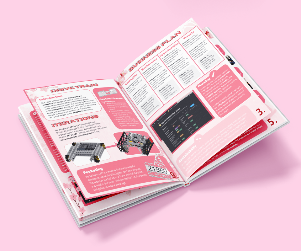
- Design Documentation: used to pitch to judges @ Trade Shows, won us 1st place
- Product Roadmap: communicated with 6 different XFN departments to hit key checkpoints before competitions
I lead the end-to-end development of an e-commerce website for a Japanese Cullinary Startup + learned to use Figma
The website won 1st place in website design out of 148 submissions as well as earning a near-perfect 4.9/5.0 judging score at the San Diego Regional Championships
Problem Discovery
With the Pandemic creating a growing demand for quick delivery platforms like Doordash, lots of food brands have given up sustainable production and personality for quick production. As resturaunts open back again, isolated students are seeking to re-kindle connections
Problem Validation

Whose Problem am I Solving?
90% of college students eat out at least once a week
70% order from a delivery platform per week, with 4 times/week on average.
Food is a source of connection. Building a platform that can appeal to student's need for speed as well as connection and sustainability can impact a large user base.
Problem Statement
User Research
My primary research methods were:
- speaking 1:1 with ~10 students at my high school (casual)
- internal research of eating habits/preferences from ~20 team members
- secondary research on general eating habits of Americans
These findings helped concentrate the website's message, instilling a sense of urgency to purchase our products for environmental and personal health reasons.

Summarizing Findings
From my secondary research, I found that broke college students resorted to unhealthy food options due to time and money constarints
(60% of
college students have less than $1k in their pockets)
To remedy this, I focused the website on accessibility, ease of use, and speed so that busy students
could get the food they needed in-and-out super fast.
Our USP: fast yet nutritious and delicious food tailored for university students. This was an idea I carried into the overall
aesthetic and brand persona of Bonsai Bento.

Hypothesis Statement
Market Landscape
I looked through current 40-50 VE e-commerce websites. I also analyzed ~10 culinary startup websites and conglomerated the results here:

Most of the VE websites were underdeveloped and neglected UI/UX. Culinary Websites were heavy on images and functionality but neglected personality completely. These were the main advantage spaces I found

The goal: transform the website experience into a story and journey
Ideation
My approach was to first gather initial thoughts and feelings from our student body (quasi user research) based on
the business plan provided to us by the C-Suite.
Ideation: The general design process was simplified; I started with basic pen-on-paper ideation sketches to map out the entire
flow of the website including the different pages included.
Hi Fi: transfered design straight to final version on Figma for agile design and development iteration
Development: decided to use wix for agile development and ability to implement all the features we wanted (at this point I had no coding experience) This allowed us to implement a ton of mini interactions without extra javascript but still creating the same user experience.


faster shipping > unecessary industry standards. The best part: the two end results are exactly the same. The former was just faster and gave us more creative leverage
Challenges
As a graphic designer, my initial design process was UI/ aesthetics-centric rather than functionality. The key issues I adressed were with accessibility and developing a meaningful and intuitive user flow. This project got me thinking more about systems design > graphic design

There were also a couple of issues with the intial design in the same vein of accesibility. I did a couple of design audits and reviews based on feedback from the CEO. I mainly redesigned the information hierarchy so that the user can purchase quickly without extra fluff in the process.

The goal was to make our website stand out visually yet have a flow that would be accessible and engaging. Here are the
ways I thought of acheving this:
- meaningful I.H.:information and CTA presented strategically in order. Serial position effect
- a focus on persoanlity: lots of mini interacetions and a larger focus on the about us page to bring the audeince closer to the origin story of our company (more personable + approachable)
- low barrier to entry: guide the user through the step-by-step proccess of purchasing with visual cues.
- clarity and transparency: detailed description pages for products including the production process and health benefits, leaving no questions asked by the customer
Landing Page
the hero was perhaps one of the most important pages since busy college students would want to quickly access
the purchase section. An easy way to accomplish this is by adding the CTA directly at the beginning
I also added a dynamic auto scroll bar (orange line divider) to add more
personality and continuity to the otherwise static website.


About Us Page
I put extra attention on the about us page since I wanted the user to feel attached to both our food AND our brand vision (ie "planting a fresh start [in order to build a sustainable future]")
Expressive Mission Statement: I wanted to tell the story of our brand in a non-boring and serendipitious way. To acheive this, I designed 2 graphics: one at the beginning and the other at the end — combined, they tell the story of our brand in a concise yet engaging manner. Instead of centralizing the "mission statement" in one section, this creates a seamless and journey-like user experience.
Focused Imagery: Instead of using stock images, we decided to use all pictures that we took ourselves. Luckily, this made the brand
much more cohesive than other VE firms.
One of the challenges I had was adding too many pcitures about our brand culture and not enough of the product.
To remedy this, I added more pictures featuring different POV's of our product ALONG with our "top-notch customer service" (ie human-centric images - people still want to
see the "people" aspect of the company)
Mini Interactions and Graphics: I wanted to add more personaity over the static "buy-now" e-commerce websites while still making the entire UI approachable and familiar. To do this, I added small tidbits of personality through personalized, dyanmic graphics and animations. watch this video for a visual.
Reflection
This was the first large website project I had tackled working with a large and diverse team (over 30 students!).
Through my journey, I learned how to navigate the startup space working to integrate products, marketing campaigns, and
C-Suite requests. Working with cross-functional stakeholders helped me see past my limited view of design and into the
collaborative work it really was.
Here are some other lessons:
- Prioritizing Functionality: after seeing dozens of designs from other VE companies, I noticed a common trend was the prioritization of aesthetics over functionality. As a prev Graphic Designer, this revelation shifted my focus from aesthetics to user flow, functionality, and intuitive design that told a story
- A constant search for inspiration: VE also exposed us to incredibly diverse fields (ex: I pitched a Bonsai Tree based video game, trade show wallet, and Rainforest festival outside of Bonsai Bento) These projects helped me think iteratively and through design rather than pure execution — a good balance to the previous point ^
▿ VE Team at the 2022 Western Regional Conference! ▿


