Co-Founder
Solo Product Designer
Product Manager
Summer 2024
(3 months)
3 Engineers
1 Designer
UX Research
Design Systems
Data Engineering
Full-Stack Development
Interaction Design
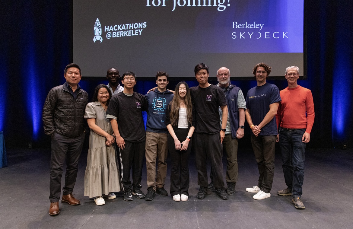
Dispatch was initially built out of a spontaneous trip to the Berkeley AI Hackathon, where my team won the Grand Prize with $50,000 in investment from Skydeck, and an additional $14,000 in credits from Intel and OpenAI. Post-Hackathon, we decided to take this project further and launched a venture with Skydeck, the #2 top ranked Startup Accelerator in the US with less than a 1% acceptance rate. I worked as the solo designer.
Outside of Design, I also developed the front-end and back-end of DispatchAI, refactored the database pipeline to more efficiently handle real-time calls, and developed a Machine Learning Model to simplify call-handling! Click here to view the full code, thought process, and design tradeoffs!
I owned the entire design of DispatchAI , from user research, developing the MVP, to the branding, final user interface, and micro-interactions. I collaborated with 3 engineers to conduct customer discovery interviews and explore technical tradeoffs.
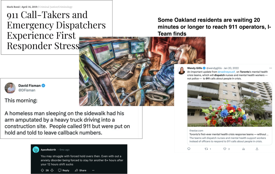
911 dispatchers are overwhelmed with non-emergency calls, which account for 80% of all calls . This leads to long wait times for emergency calls, and inefficient resource allocation . Dispatch aims to solve this problem by automating the process of handling non-emergency calls.
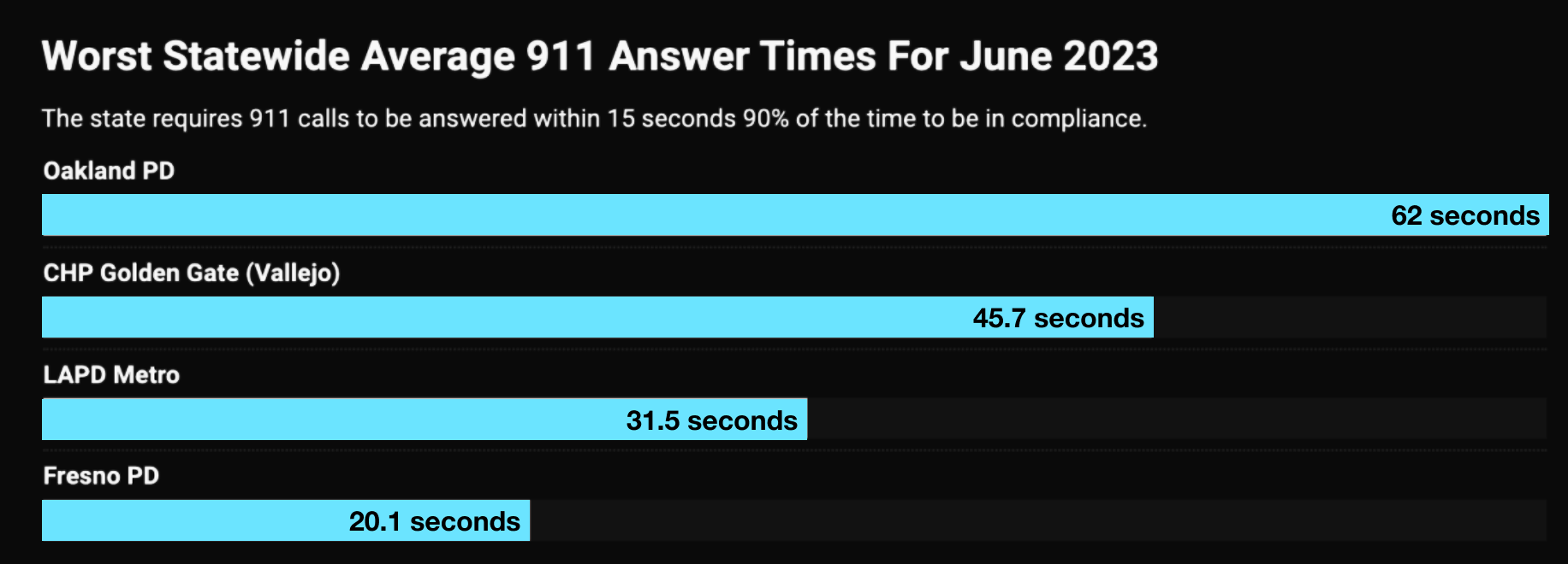
The Oakland and LAPD Dispatch have wait times that fail to meet government safety standards almost every day of the year.
Imagine a major earthquake striking a densely populated city. Within seconds, thousands of frantic 911 calls flood the emergency call center. Every line is busy, every second counts, but the overwhelmed operators can't answer every call. This isn't just a hypothetical scenario—it's a grim reality for many emergency services today.
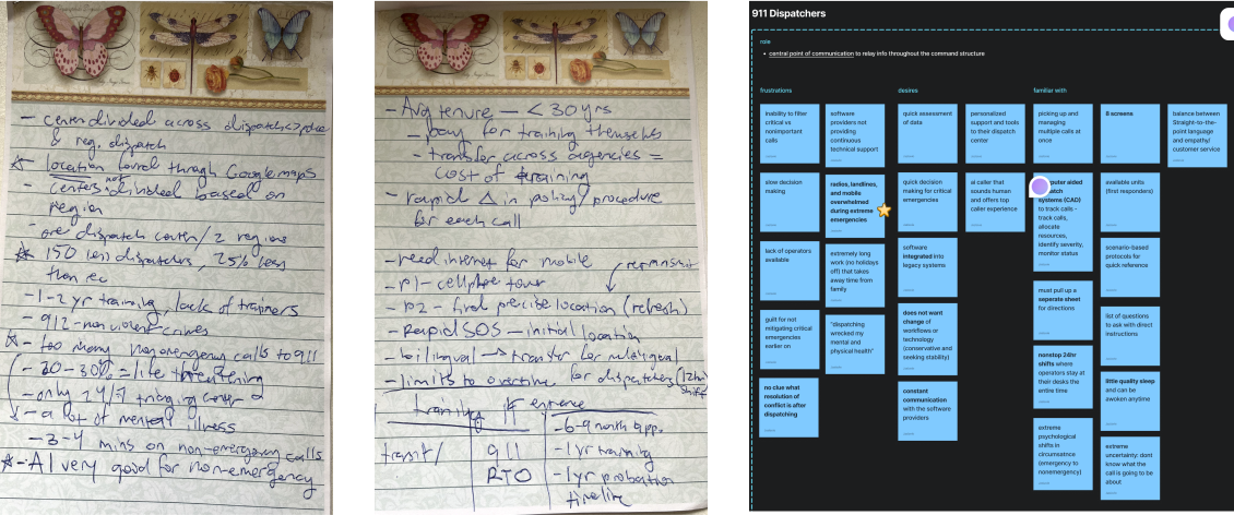
When we got invited to tour the LAPD for an onsite tour, I decided to drive 60 miles to Culver City to talk with users IRL.
We plugged into 911 calls to observe procedures firsthand and also spoke with a Staff Psychologist about common dispatcher stressors.
After the meeting, I transferred my notes to Figjam and identified key workflows and behavioral patterns that would inform the design solution.
— LAPD Deputy Chief
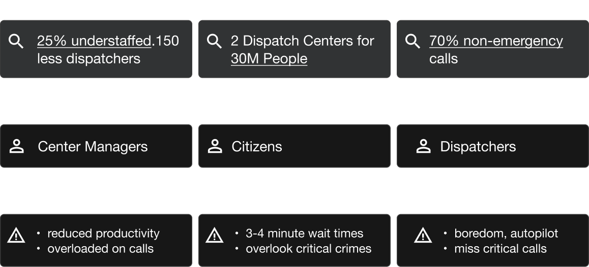
After the visit, I connected the dots across data points, stakeholders affected, and pain points to understand the root cause and affected parties at the LAPD Center.
The LAPD dispatch center is
overloaded with non-emergency calls that exacerbate
their staffing shortage (which is uncontrollable), reducing the
quality of emergency response.
Offloading non-critical calls to an AI system could
reduce cognitive load and improve response times with the
same number of dispatchers
Our conversations with dispatchers, LAPD staff, and previous owners helped us uncover critical problem spaces to tackle. With this, we aimed to identify intervention points where DispatchAI could make the most impact.
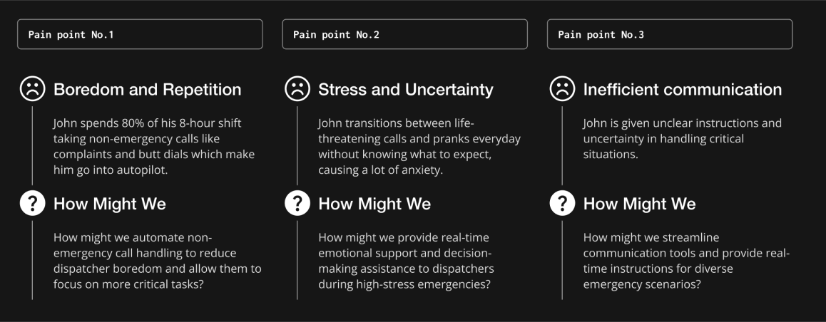
After consolidating research from expert interviews, field / observational research from the LAPD, and conversations with the staff psychologist, we defined the core frustrations, experience, and aspirations of our target user: John.
I developed a user flow after our conversation with the LAPD to map out key decision points (currently 3 in total marked by diamonds). The Current operator flow is messy with multiple manual steps and decisions that increase cognitive load . Our goal is to shift this paradigm to give operators back their confidence.
This journey map visualizes the steps taken by operators during a 911 call, from the moment a call is received to the dispatch of emergency services. It highlights the pain points and opportunities for improvement in the current system.
The research revealed that poorly-documented emergency calls caused by the unpredictable circumstances of dispatch is the root cause of distress. The opportunity, therefore, is offloading documentation to a more accurate and efficient agent
Based on our characterization of the target user, we conclude the following being crucial considerations in our design strategy:
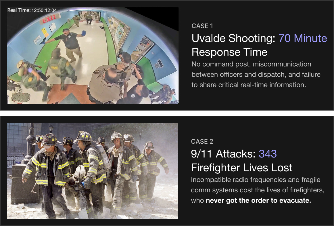
Communications Failure is consistently identified as the primary cause for delayed first-responder response. This has caused unnecessary and tragic deaths that could have been avoidable with more effective communication systems
To address the communication failures that delay first-responder actions, I developed flow diagrams mapping the critical roles and decision points during a live emergency. By identifying key dependencies and breakdowns, I used this to inform the design of the handoff flow, ensuring vital information is funneled to all incident stakeholders.
The primary goal is to increase interoperability and efficient handoff of critical information while reducing the cognitive load of the dispatcher. This requires a careful balancing act between automation and human-in-the-loop decision-making. This will be addressed in future architecture designs.
With key decision points, operator frustrations, and the user
journey defined, we prioritized features that
directly addressed the core problem of cognitive overload
from nonemergency calls.
Based on the prioritized features, we worked to map each core action on a timeline. We emphasized areas to incorporate humans in the decision-making process as to maintain dispatcher’s autonomy and expertise in the end-to-end emergency cycle.
Research demonstrated that 9/10 calls are noncritical. This is not only exacerbated by the staffing shortage, but causes critical mental health problems for dispatchers. In large-scale crises, delays can result in preventable deaths.
Most calls are built around radio frequency. Interference with these brittle mediums can cause the entire communication line to collapse. This is what happened during the 9/11 attacks when hundreds of firefighter lives were lost due to insufficient communications infrastructure.
Manual instruction scripts, muffled calls, and quasi geolocation services are daily experiences for dispatchers. This has led to misinformed decisions, inaccurate location identification, and extreme stress for dispatchers.
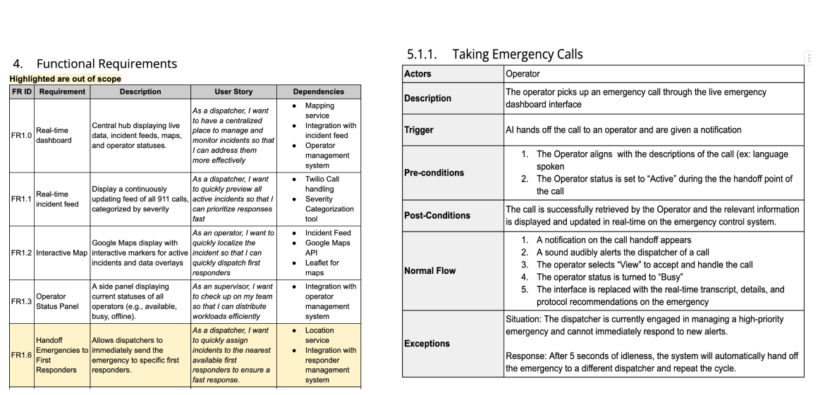
On top of Product Design, I also acted as our team's Product Manager to translate and define requirements based on user insight. Our product goal is to design intuitive and customizable modules to enable dispatchers to make quicker decisions with more confidence and less stress.
With my team, we defined several core functional requirements:
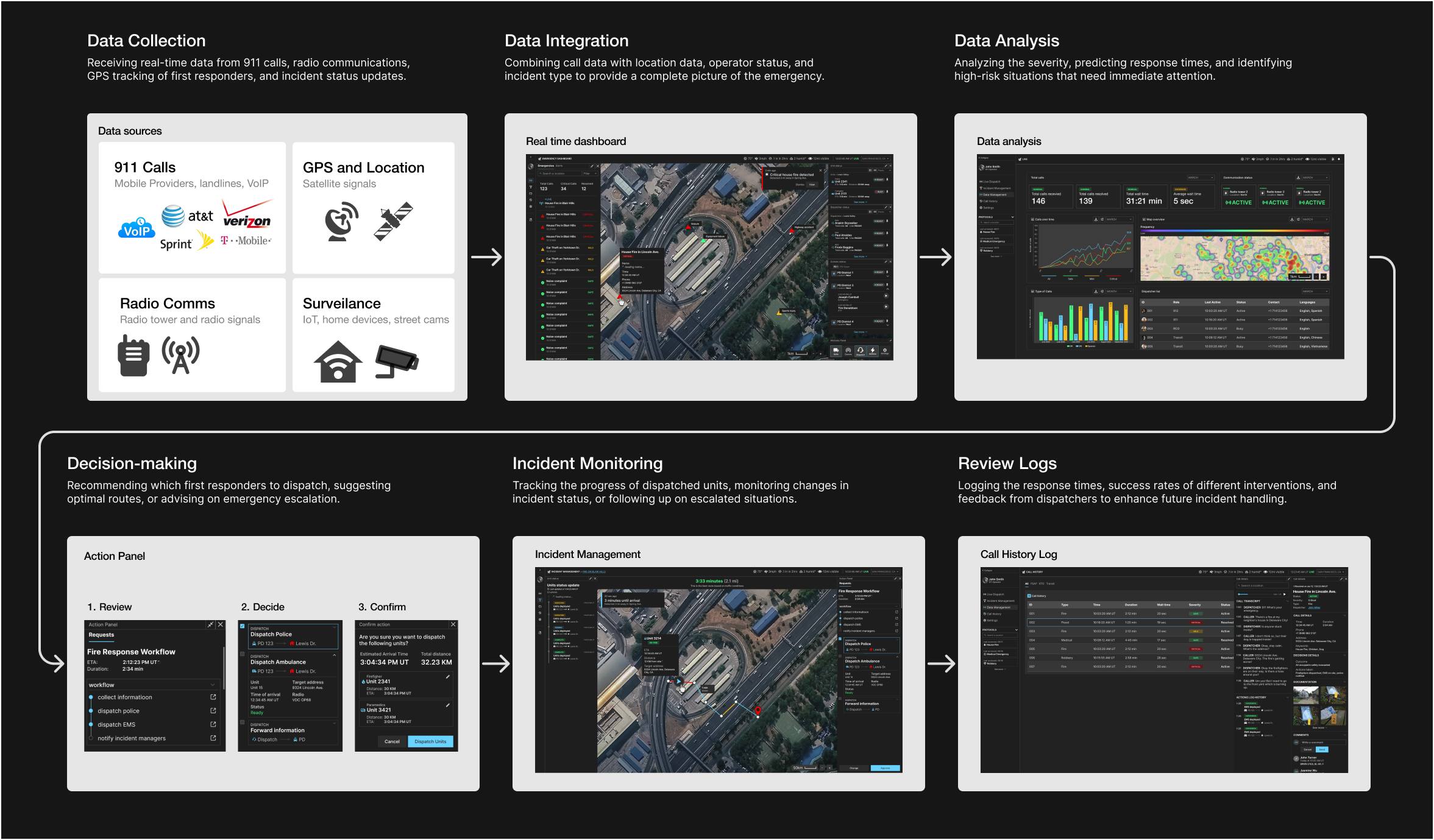
Dispatch AI is designed around a continuous operational loop where data is collected, analyzed, and integrated to inform real-time decision making. Data is logged and used to inform future decisions.
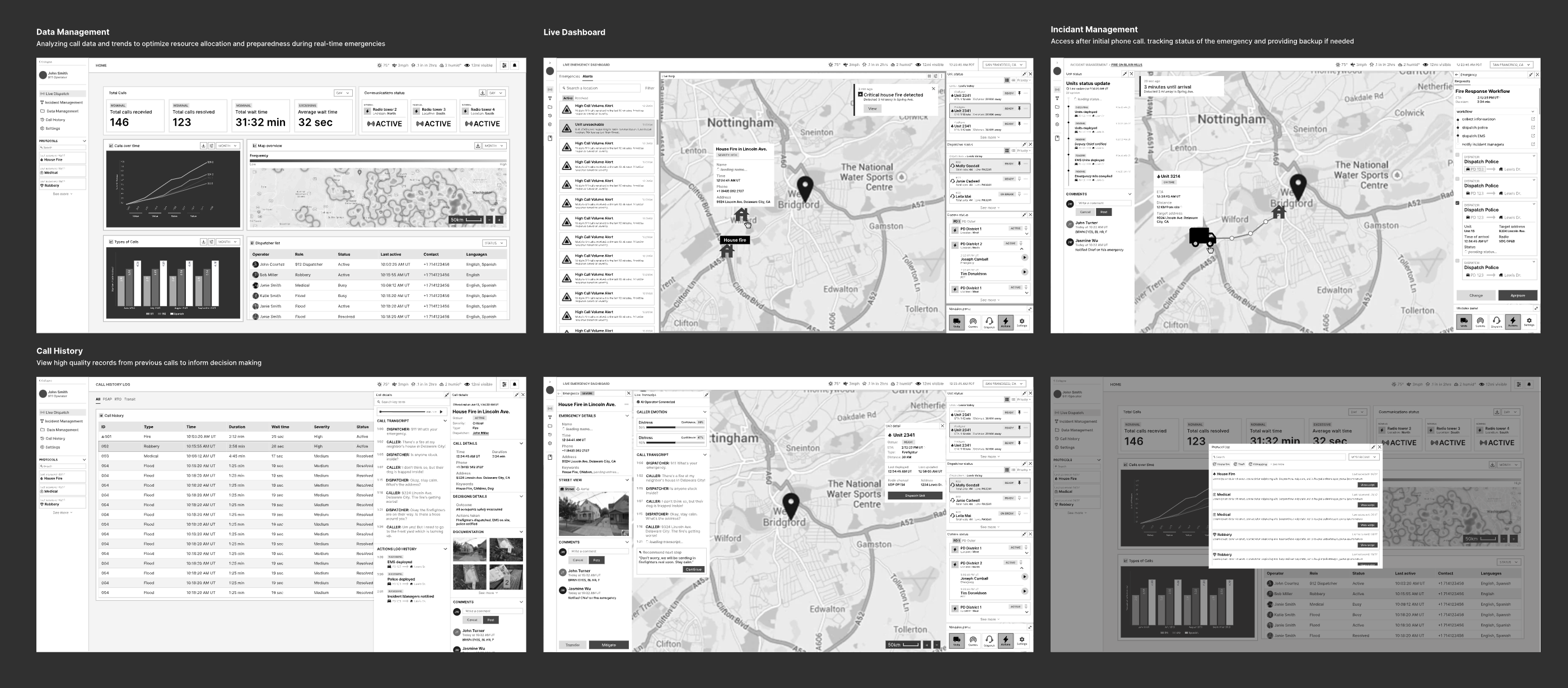
Based on feedback from the LAPD, the lofi design prioritizes
modularity through panel-based widget design and
meaningful organization of information so operators
can quickly access information that drive action.
The following were developed at this stage:
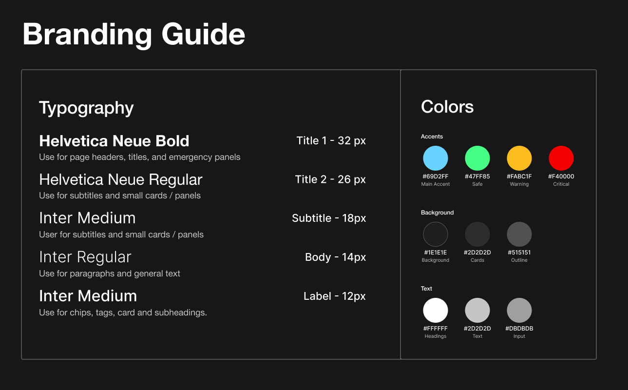
After finalizing the overall information architecture, I developed a design system with colors and icons aligned with the NATO Symbology guidelines for military and government applications. The modules were further refined with additional detail to align with the multi-tasking workflow dispatchers are familiar with. Fully equipped screens were prioritized over limiting information.
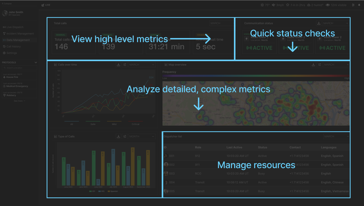
This is based on how humans naturally read information: top down and left right. This is how data is represented to prevent passive ingestion and promote active decision-making with data.
I improved on the MVP designs from the Hackathon based on new user
interviews and conversations we had with dispatchers and
government officials.
Design decisions that were made:
Translate languages, view transcript, and approve recommendations during a live call.
AI recommends actions based on historic and live data while the operator reviews and selects those to approve.
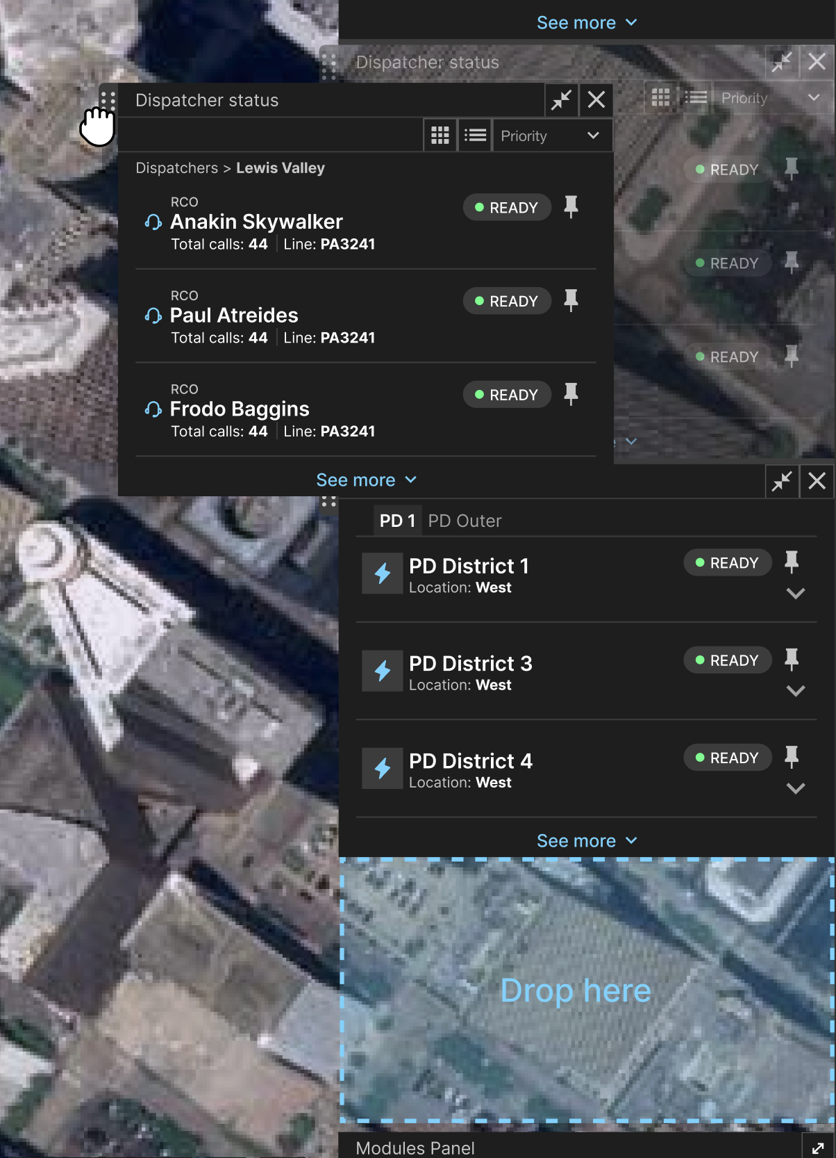
Dispatchers can customize their interface and toggle on-off modules at will. They can expand modules to view more info.
Alerts are generated from live calls. Dispatchers can view old alerts or resolve new alerts.
Dispatchers and Center Managers can view previous logs of call data to inform future decisions.
Forecast future calls based on historic call data and geographic metrics.
Give operators more freedom and customizability with their interface to display necessary situational data at different parts of the workflow.
Operators can monitor the path first-responders will travel based on live google maps data. They can see the traffic between each waypoint, view status updates, and recommend a change in the route if necessary.
Keeping the operator-in-the-loop by incorporating their feedback during decision-making. This data will be used to inform and adapt future AI recommendations.
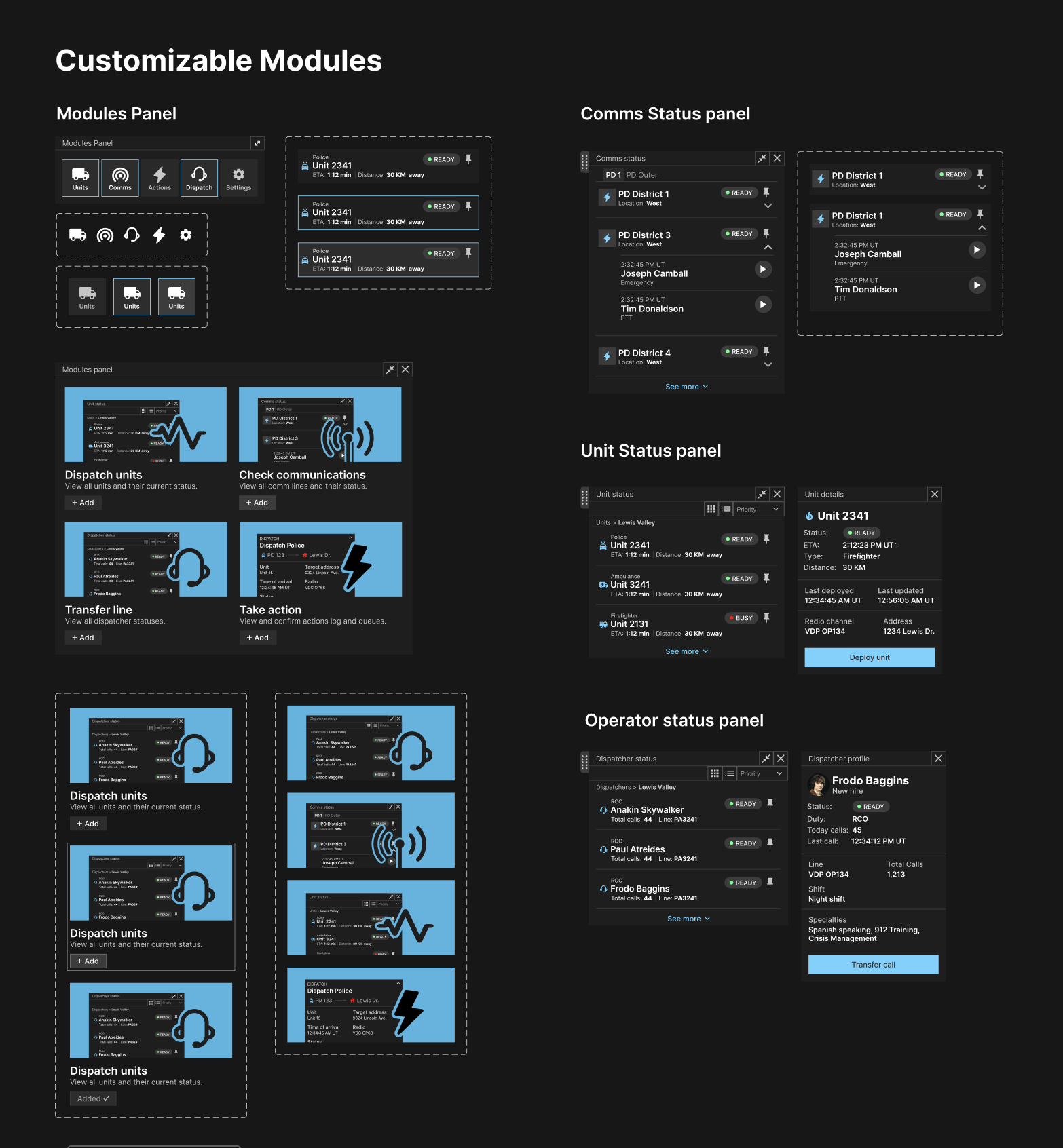
To enforce customization and modularity, all panels are draggable and can be turned on and off depending on need. This increases situational awareness and enables more autonomy in deciding what info is most important.
I re-calibrated the data management system from
Postgres to Redis to handle real-time calls. Research
indicated that speedy communication is crucial. The technical handling of live calls has
significant impact on user experience and enabling a
scalable architecture.
I re-evaluated and re-programmed the codebase to address the
inefficiency with Postgres.
I programmed a Machine Learning Pipeline with historic call data (sourced from online call datasets) to recommend actions, live script messages, and forecast high volume call periods. I trained a model with Long Short Term Memory (LSTM) and the GPT4 to generate script recommendations.
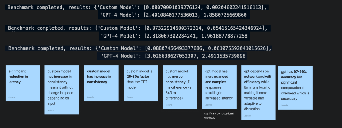
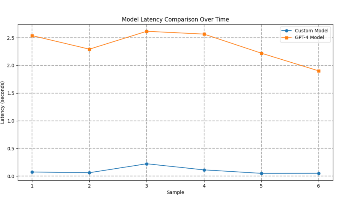
I developed benchmark tests to evaluate the comparative efficiency of a sequential model vs parallel processing. Since the speed of data processing directly impacts the way information is consumed by the user and the response time (a core business metric), this exercise gave extra context for the design.
Measuring latency of a single input prediction.
Large Language Model used for Complex Natural Language Tasks.
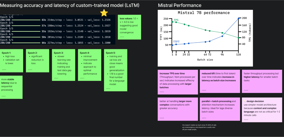
Caller scripts are streamed sequentially in real-time. Thus, LTSM
is ideal for simpler non-emergency calls with
limited computational overhead and faster response times.
Latency: LTSM has more consistent latency. Mistral
increases latency proportional to batch size
Accuracy: Mistral is ~13% more accurate than LTSM,
however the latency is less consistent
I evaluated the technical and design trade-offs of implementing a simpler, LSTM algorithm and corresponding design decisions based on user and business goals.
The design system is aligned with NATO Iconography and Color Guidelines. Widget components are modulated to fit multiple use cases for different emergency scenarios.
Panel and modal components for a modular design palette.
Despite the demanding nature of dispatch work, there should never be a case where human judgment is completely sacrificed for automated decision-making. I ensured that every key decision point is attached with human confirmation. Additionally, feedback loops adapt action recommendations based on operator input.
Designing the interface while also balancing customer discovery
calls and on-site tours taught me the importance of constant
iteration. Every dispatch center expressed derived value from
different feature proposals (ex: dispatcher trainings vs 912
calls).
It is important to iterate strategically. Early on,
we identified nonemergency calls as our primary
vertical, and stuck to this. Despite dispatch centers giving us
related frustrations, we recognized the
root issue was resource overwhelm from high call
volumes
. This is what we iterated on.
more to come soon...